Creating a proper "About" page
Did you know -
Typically, the second most visited page of any website is the about page.
I think general statistics will prove this to be true, but I also know it from personal experience. As one example, when I was examining the site traffic for the Cisco Networking Academy redesign project, I found that after visiting the homepage, ~45.24% of visitors took a next step towards About Us related content. In other words, one in two people were most interested in answering questions like:
Wait, what is this?
Who are they, what are they doing, why are they doing it?
Who’s running this, how long have they been around, what impact have they had?
This curiosity about purpose, history, credibility, etc. is nearly a universal trait.
So much so, that even if you do not have an about page, you should know that the desire still exists from your potential customers, employees and partners to learn more about you. And the About page is the perfect page to tell your version of your story.
Let us stop here for a moment to recap the two mistakes that are all too common:
Not viewing your About page as important, and therefore neglecting it
Not having an About page and therefore leaving potential customers to take their best guess at who you are and why you exist
Stick with me for a few minutes and I can help you remedy both of these problems. I’ll walk you through a couple of projects, especially the most recent About page redesign I did with the WhyHotel team.
Let’s go.
First, what makes a proper about page?
About four years ago I set out to learn what makes a great about page, but sadly, I had a hard time finding companies who were proud of theirs or even high-quality examples to follow.
I was tasked with wireframing and writing the new about page for Cisco Networking Academy and without good inspiration to turn to, I thought through a few of the important elements to potentially include. Here’s a quick list, sorted by priority:
Your version of the future, the narrative you believe, a strong positioning statement
Your version of your story
A behind the scenes look at your company, how you operate
The values that drive your decision making
Your business model, value propositions
Personalize it
Speak to individual audience segments
Build credibility, often through logos, longevity, pedigree, press mentions, etc.
The way in which you communicate these things will be a matter of brand strategy, but this at least gives you a place to start from.
A proper story-driven About page
For the Networking Academy project, I really chose to emphasize the telling of the story, but in a way that felt like the story was unfolding before the user and helping them to see the real lives that had been impacted by the program. This turned into 8 slides, each with a real program photo and each emphasizing a unique benefit or result from the program.
A proper positioning and business model About page
The story-driven approach worked well for the Cisco project because they operated as Corporate Social Responsibility program and they had real people impact at the center of their business model.
But what if you don’t have these things? What is another approach you can take?
For the recently completed WhyHotel About page, we did have to do something different. As a startup, they were still building their story, and rather than the impact they were having on the lives of people, it was more compelling to highlight the innovation they were bringing to the relatively traditional hospitality industry.
The concept behind the page came from a single statement I heard a member of their team say:
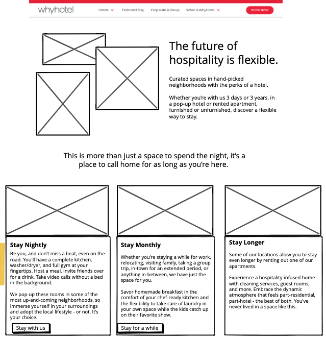
The future of hospitality is flexible
I knew this phrase needed to be the core of the rest of the page. Here’s how to project came together.
First, here is what the previous version looked like.
Upon analyzing the page, I came to a few conclusions (much of these based on the previous work I’d already done on the brand):
I wanted to lead with our strong positioning statement
Rather than directly compare ourselves to others, I wanted to show the benefit. (I’ve been branding this as “the WhyHotel experience”)
The business model needed to be more present (from the short-stay traveller all the way to the real estate partners)
I realized individual travellers might come to this page and then get confused as to what exactly is being offered
While the logos of press mentions are important, I didn’t think they needed to be so high up on the page.
Based on these conclusions, I used Balsamiq to do a quick wireframe of the page. In order to save time and developer resources, I wanted to borrow from some of the same content elements we were already using on the rest of the site.
The cloud version of this wireframe was circulated and feedback from the review group was collected. The updated wireframes were then given to the designer to mock-up.
Design always brings copy to life, and so inevitability, there was one additional round of copy edits to be made. (Never mark your copy as final until you’ve given chance for a round of review seeing the copy in the designs)
The new About page just went live today. I’m really happy with how it turned out.
Concluding thoughts
Every about page will have slightly different requirements, but here are a couple of examples to use as inspiration, along with a bit of insight into my process.
Do you have an About page project you’re working on and you’d like a second opinion? Send me an email: derek@plain.run
Looking for a strategic copywriter to assist your team?
My name is Derek and I write all kinds of things for businesses of all sizes in many different industries. Do you have a writing or strategy need? This is what I love to do.
Send me an email: derek@plain.run


